Happy New Year everybody. I've got a lot of fun articles in store for 2008, covering everything from photography, filmmaking, visual effects, movie marketing, and any other garbage that's floating around in my melon.
In the meantime, let's take a look back at some of the red-letter articles from FXRant in 2007.
April 2007, "Hey, I Know That Shot!" Some screenshots of my shot from "Pirates 2" appearing on the Academy Awards telecast.
The great news is that "Lost" returns on ABC for eight episodes, starting on January 31st. And to help remind you of the events of the previous three seasons, ABC has put together an 8 minute 15 second video summarizing some of the key story points of the show.
"Catch Up On Lost!", created by ABC
And if the format of this retrospective seems familiar, it should. The ABC team borrowed the format of their clip from Paul Gulyas and Joe Sablas' fan film, "7 Minute Sopranos," which summed up "The Sopranos" previous six and a half seasons.
"7 Minute Sopranos," by Paul Gulyas and Joe Sabla
With the similar stylistic elements of the fast talking narrator, extremely quick clips, interspersed with a line of dialogue to punctuate a plot point or to get a laugh, as well as occasional sarcastic remarks by the narrator, we have ourselves a new 'retrospective' genre, essentially created by Gulyas and Sabla.
One thing I tell young visual effects artists, particularly compositors, is "watch a lot of movies." When creating photorealistic effects for live-action feature films, the artists' paramount concern is to build up the plausibility of an unreal event; to create reality from synthetic. Understanding the complex way in which light is captured by lenses and recorded onto film is the foundation of this skill.
But what does "watch a lot of movies" really mean? Well, I firmly believe you can develop a strong photographic vocabulary, particularly revolving around creating photoreal composites, by looking at movies by decoding and deconstructing how they look. And not just any movie-- non-visual effects movies. Take particular notice of how these in-camera, non-effects shots appear; their characteristics, their aberrations, the way light dances through the lens to give us a recorded image, how camera movement affects the image, how different colors and intensities affect the image, just to name a few ways.
This is a long way of introducing a little viewing exercise from John McTiernan's "Die Hard With A Vengeance" (1995). There are, in fact, plenty of visual effects in "Die Hard 3," supervised by the deepest-voiced vfx supe in the business, John Sullivan. But the shot that we'll be examining is not an effects shot. It's a good, ole-fashioned, carefully choreographed camera move with multiple cues for actors and stunts. It also has the important duty of showing the audience the antagonist of the film for the first time.
Look at all the beautiful things that are happening in this real, non-visual effects shot, and pay close attention to the three frames that are labeled "snap" at the top of the screen.
First, let's look at the context of this shot. We've just gone through a series of tight closeups on police officers planning a strategy to deal with a terrorist attack. Then we cut to our shot-- a wide, birds-eye-view shot looking straight down on the cops, scattering into action. The camera dollies across the edge of the building, revealing that our villain, Simon Gruber (Jeremy Irons) has been watching them all along through binoculars. Thematically, this view matches the villain's perspective; the cops are ants crawling around New York, playing a part in his master plan, almost like a gamer looking down at a board game. The camera tilts up to reveal Irons' profile, and his line "They bought it." He turns his head to an offscreen henchman: "You can begin."
The choreography of this shot is deceptively simple - but if you take a look, it is extremely complicated and required a good deal of rehearsal timing (there is virtually no dead time between the start of the tilt off the cops, revealing Irons' binoculars) and careful cues.
Now, here's where the effects artists really need to pay attention. Watch Irons' face carefully through the camera move, where the camera tilts up to follow Irons rising from a crouched position, particularly on the "snap" frames.
Check out the values on Irons' face. It goes through a subtle change. Notice how his face seems to brighten throughout the shot. Is he moving into a light? No-- although there may have been some bounce cards and fill lights set up on that rooftop, he is not rising into a pool of light. Is the operator opening the aperture on the camera, letting more light through the lens? No-- that's not happening either.
Now, take a look at the space that is behind Irons, relative to screen space. At the head of the shot, the lens is completely filled with buildings in the background. Near the end of the shot, a significant part of the frame is filled with sky - an overexposed sky that has light values far beyond anything in the frame. The sky is so overpowering, it is polluting other parts of the image that is being captured by the lens. In effect, the sky is flaring out and flashing darker, foreground elements within the frame.
I've isolated Irons' face on those three "snap" frames, and placed them side by side against a gray card, so you can clearly see the progression.
And this flashing isn't merely a depth issue. Take a peek at the midground building-- the dark strip of skyscraper on the left side of the frame. It also gets flashed and more exposed as the tilt occurs. This is a screen space phenomenon, not necessarily a depth-based phenomenon.
What does all this mean to a visual effects artist? We are frequently asked to put together bluescreen foreground actors against virtual or photographically-based backgrounds. Think of all of the thousands of visual effects shots comprising of an actor photographed against a bluescreen, composited over a realistic background.
Pulling a bluescreen is not rocket science. Compositing the pulled bluescreen over a provided background isn't brain surgery. The tools to perform these tasks are robust and ubiquitous. However, there is no shader, rendering engine, nor compositing program that will automatically perform these kinds of real, photographic phenomenon, as far as I know. The software does not know how to simulate this kind of organic, analog phenomenon. And, frankly, I think this is a good thing. Any such tool would take away flexibility from the artist. This is not a technological issue - it's an artists' issue.
When compositing an element over a background that has heavily overexposed, make sure to slightly overexpose the foreground a little bit, or flash the foreground a bit. Technically, the cause of the foreground overexposure is a lens flare, but it is so large, soft, and without character and detail, there is really no need to build a digital lens flare. And the phenomenon does not occur solely over the edges of the foreground element; this is an effect that affects the image from top to bottom, or as large (in screen space) as the overexposed background.
In an upcoming article, I'll go over some techniques to simulate this phenomenon in two popular compositing applications, Adobe After Effects and Apple Shake. In the meantime, watch movies in a different way, trying to deconstruct what is actually happening on the screen, with the key intent on reconstructing these phenomenon in your effects shots.
The humor that comes from The Onion is rooted in the fact that an element of truth is at the basis of all its stories.
But sometimes, the stories are 100% true, and written in honest language without the need of exaggeration or parody. Sometimes, they're dead-on. And these are the articles I think are the most well-written from The Onion; they're simultaneously funny and sad.
PITTSFIELD, MA-A new television commercial from General Electric, unveiled Tuesday, proudly trumpets the company's federally mandated cleanup of a river it polluted.
I love how author David Bordwell launches into a topic and digs deep. One of his terrific articles is "Unsteadicam Chronicles," from his website. I don't necessarily agree with his viewpoints, but I adore how deeply involved he gets with his material.
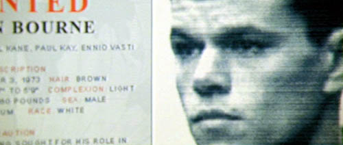
Personally, I thought the camerawork and cinematography of "The Bourne Supremacy" was brilliant. (Unfortunately, I haven't seen "Ultimatum" yet.) Like J.J. Abrams' "Mission: Impossible III," the Paul Greengrass' Bourne films, as well as Doug Liman's original Bourne film, are point-of-view superspy films, and the camerawork reflects this. In these cases, I believe that the handheld work does not camouflage or hide shoddy staging, set design, or acting (as his article suggests). The camera is moving as fast as our hero spy, and sometimes the speed is so intense that makes a scene abstract. I'm thinking primarily of "Supremacy's" car chase, with frequent cutting to blurry, intense Bourne-point-of-view shots.
However, as a general rule, I think is it paramount for a filmmaker to set up the geography of an action scene so that the audience can follow along with the choreography.
James Cameron is the undisputed master of orchestrating complex action sequences that take place over large expanses of space, and yet the geography is expertly laid out for the audience, allowing the audience to fully enjoy the sequence (see "Terminator 2," "True Lies," "Titanic," and "Aliens"). The opposite is true of Michael Bay, whose style suggests that every single shot is a hero shot, and its context is irrelevant ("Transformers," "Bad Boys II," "Armageddon").
As you may have guessed, I have a few articles in the pipeline concerning this subject. We'll be examining the construction of an action sequence from Cameron's "True Lies," as well as a scene from Bay's "Transformers," to illustrate how to create (and destroy) an audiences' sense of geography for an action sequence.
If you're still lounging around after reading about the interesting stylistic similarities between "Beowulf's" marketing campaign with "300," I salute you. And also question your sanity.
You'll find a lot of articles about visual effects techniques (I'm a visual effects artist at Industrial Light & Magic; I was a sequence supervisor on "Transformers" and "Mission: Impossible III"), filmmaking, sound design, Stephen Colbert and "The Daily Show," Apple, and a whole lot more. All in all, just a lot of good, clean fun, interspersed with questionable grammar and the occasional spelling error.
Make yourself at home. Leave a comment, while you're at it. In the end, I just hope you have a good time.
And if you're really in the mood to puke, go to my home page, or my IMDb page.
Another in our series, titled "Movie Marketing is Hard!", illustrating the lack of creativity amongst studio ad campaigns.
Zack Snyder's "300" made a lot of money. How much money, you ask? $450 million. Of course, if you asked the marketing geniuses at Paramount behind the "Beowulf" ad campaign, I'm sure they would have corrected me, and answered "$456,068,181, domestic plus global."
Why would the Paramount marketing team know this fact so intimately? Well, it's clear that they've been studying the ad campaign for "300" very carefully. Among many stylistic and clear similarities between each films' trailers, here are a few highlights:
Both trailers have the lead, bearded, warrior hero, in closeup, loudly proclaiming that "THIS! IS! SPARTA!", or, "I! AM! BEOWULF!"
Each trailer has an anachronistic guitar-riff-filled montage of violence, wrapped up with our warrior hero proclaiming something about "TONIGHT..."
And, most obviously, each trailer's graphics are rough, bold, blood red, and set against time-lapse clouds with lightning bursts.
Sure, there are some broad, thematic similarities to both pictures. But the "Beowulf" trailer is clearly trying to mimic the success of the "300" campaign, with no attempt at subtlety or, perhaps, advancing on the style that "300" created. There are several different ways to market a film. It takes a gargantuan lack of creativity to simply carbon-copy a previously successful campaign.
Whoa, whoa, whoa, do you know how fast you were going? Looks like we have to hand out our first Camera Shake Citation [all Camera Shake Citations].
In an effort to educate visual effects artists on various techniques, we dutifully write up a Camera Shake Citation to "The Sentinel," the 2006 thriller directed by Clark Johnson, and starring Michael Douglas. In the offending scene, a helicopter comes under attack from a surface to air missile, and gets blown out of the sky.
So what's wrong with this camera shake? Let's first analyze why the camera would be shaking in the first place.
The visual effects artists' job, in this case, is to make you believe that a giant helicopter just got nailed by a missile in real life, and the filmmakers set up this elaborate stunt, in real life. So we need frame this shot like a pyrotechnics stunt that was filmed.
Let's assume that the camera photographing this event is in another helicopter at about the same altitude. With the intensity of the explosion, it's a near certainty that the shockwave would affect the camera's position in some way. However, at this range, the shockwave would take a few moments to reach the camera.
Unfortunately, the camera shake begins at the very first sign of fire. And fire doesn't cause a camera to shake. A shockwave of air blows a camera fixed to a tripod, or held by a camera operator, backward, and ultimately forces the camera to bobble up and down. If the camera is on a tripod, the movement will be largely be up and down (tilt). If the camera is handheld, the blast would force movement in both pan and tilt, and dutch (rotation).
If the digital artist had delayed the camera shake a few more frames (let's say, four), it would have lent the shot a much more realistic feel. Subconsciously, the viewer accepts the fact that a blast of air needed a few frames to reach the camera.
In addition, it would have made the scale of the shot feel much bigger. With the camera shake starting on the precise start of the event, it makes the event feel small, more intimate. To give an explosion shot more gravitas, make sure you give enough time for a shockwave to actually hit the camera's position before starting to shake the camera.
Next time one of those "World's Scariest Explosions" programs (yes, that's a real show) is on television, make sure to watch it. There are dozens of examples of this phenomenon on a 'caught-on-tape' show like this. For example:
This is, of course, a ridiculously huge, real, explosion, but notice the time between the first sign of fire and the shockwave/camera shake. "World's Scariest Explosions" has many more clips like this.
One other unfortunate aspect of "The Sentinel"'s camera shake, is the initial zoom. There's an obvious animated scale-up of the comp as the camera shake begins (you can tell from the radial blur along the edges of the frame, and the fact that the image gets larger). Are we to believe that the camera operator, shocked by the explosion, instinctively zoomed in to better catch the action? No. Compositors need to punch in on a shot to shake the camera in the comp - otherwise, you'd see the edges of the frame as we pan/tilt off the image.
In my experience, unless you can absolutely camouflage your animated zoom, you're better off keeping the shot scaled up from the start of the shot, and bite the bullet of a slightly tighter initial composition. If not, you'll get what you have right here - another slightly odd tick in a shot's camera shake.
The shot is actually fairly effective, if it weren't for the camera shake. The fireball is far too large and milky, and there really isn't any debris flying around. And the propellers don't seem to impact the fireballs at all. OK, well, maybe it isn't that effective of a shot.
Our first Camera Shake Citation has been issued. Now, drive safely out there, and keep it under 55.
Here's one of the greatest interviews ever to appear on "The Colbert Report." Witness the amazing timing by studio director Jim Hoskinson, with amazingly clever uses of live, on-the-fly greenscreen effects, as well as careful, infrequent playback of recorded clips. Genius!
Why would a visual effects shot deserve to be issued a Camera Shake Citation? When the camera shake created for a visual effects shot is unrealistic, unmotivated, or just plain wrong.
Adding post-moves to visual effects shots is nothing new. We've been adding camera moves to shots since the early days of optical printing. But in the last few years, things have gotten out of hand. There are just too many poorly executed camera shakes in today's television and feature films.
Just as digital lens flares became overused and abused in the 1990's, camera shakes today are out of control. These citation-worthy shots have camera animation that is fakey, cartoony, unrealistic, all generally lacking a clear understanding of the physics of a true, realistic camera shake.
Be careful... or the camera shake police will pull you over.
Either the production shot an empty plate and a clever animator did a brilliant job animating the jet within the frame, or the production photographed an actual fighter jet taking off (then erased the fighter jet and put the stealth fighter in its place), which would give the shot a built-in amount of spontaneity.
For this shot, it turns out that the aerial unit for "Stealth" photographed actual F-18 fighter jets landing and taking off from the aircraft carrier USS Abraham Lincoln, according to Jody Duncan's article in Cinefex 103.
Also, I wanted to include this quote from director Rob Cohen, also from Cinefex 103:
Cohen used the term 'gamer cool' to describe his overall aesthetic for the movie. "Gamer cool meant that a kid who is a computer game fanatic would look at every aspect of this movie and think, 'I don't want to just watch this movie-- I want to play it!"
Dear lord. So, did any of you 'computer game fanatics' out there who saw "Stealth" want to play the movie? (Whatever that means.)
I found some photos from my "Transformers" presentation at the Adapt Conference.
Here's I am, acting like I know what I'm talking about.
Here's I am taking questions after the hour and a half presentation. I was told there were around 1000 people in the room.
After the presentation, many people came up to the podium with questions... and for autographs. Stop laughing. Emile Ghorayeb, one of Adapt's founders, and me.
"I'm addicted to visual speed," says director Rob Cohen in an interview with Popular Mechanics. If Mr. Cohen went to a 28-day rehabilitation clinic for his dependence on 'visual speed,' then maybe "Stealth" could have been a better film. "Stealth" (2005), directed by Mr. Cohen, is a ridiculously bad movie. The plotting, story and characters are as childish as a Chuck Norris action flick from the '80's. Its central theme, the struggle between humanity and robotics, is as old as science fiction itself, and this garbage-film adds nothing to the mythology of this classic theme. But there are some really good visual effects in the picture, and with a bit of directorial restraint, the film could have easily been something unforgettable.
The most successful visual effects shots from "Stealth" are those of the futuristic stealth bombers landing, taxi'ing, and taking off from seabound aircraft carriers.
For all intents and purposes, these shots look and feel completely photoreal. There are no tip offs or visual cues to lead the audience to believe that these shots are anything other than natural, in-camera work. For all we know, the filmmakers got their hands on some amazing new military planes, and is cooperating with the military on the making of the movie. Of course, the reality is that these futuristic jets don't exist in the real world.
Special effects supervisor John Frazier did, in fact, build a full scale mockup to be placed on a gimbal for bluescreen photography, and also for some insert shots of actors getting out of the fighters. But the vast majority of the stealth fighter shots feature a fully CG plane, created by Digital Domain, under the supervision of veteran effects supervisor, Joel Hynek.
Completely realistic CG planes are nothing new; however, what makes these aircraft carrier shots in "Stealth" special is that the background photography is extremely naturalistic. The camera moves effortlessly around the planes; the shots don't 'feel' like effects shots, since the camera moves are part of the film. Even the shots of the fighters taking off and landing have pleasant camera choreography. Probably the single biggest advancement in the quality and plausibility of visual effects shots in the digital age is the relative simplicity of camera matchmoving complicated live-action camera moves. The ability to recover the precise placement and pan/tilt information from the film camera has allowed visual effects shots to graduate away from lockoffs and stilted motion control moves. Now, it's completely normal for a visual effects film, even one with hundreds or even thousands of shots, to not have a single true lockoff or motion control setup.
The shot shown above is a great example of the kind of naturalistic camera movement and choreography of which I'm referring. One of the stealth fighters takes off from the aircraft carrier, with the camera traveling along a parallel path. Notice how the fighter isn't precisely framed exactly in the center of the frame; the camera operator is either a little bit ahead of the action, or a little bit behind. This is exactly what happens in real photography. The operator knows that the plane will accelerate very quickly and take off, but the operator doesn't know exactly how fast it will happen. Plus, the operator is making many micromoves per second to get the best framing possible. All of these tiny cues are there in this "Stealth" shot. Either the production shot an empty plate and a clever animator did a brilliant job animating the jet within the frame, or the production photographed an actual fighter jet taking off (then erased the fighter jet and put the stealth fighter in its place), which would give the shot a built-in amount of spontaneity. Either way, this naturalistic camera choreography really helps sell the illusion.
As the bombers take flight, the synthetic planes move through entirely synthetic environments. Digital Domain made some huge strides on this visual effects tool, significantly advancing their terrain and cloud generating techniques. The process allowed them to create hundreds of flying shots without needing to rely on actual aerial photography.
Creating actual photographic backgrounds for aerial shots can be an expensive, frustrating process. It doesn't matter how much previsualization you have prepped before shooting starts; shooting plates in the air is a difficult, expensive process, and inevitably you have to make a lot of sacrifices. Getting all the coverage you need can cost a fortune, and unless you have another plane to photograph (or at least something in the frame for reference), you are shooting empty plates and hoping that something can be pieced together once all the film gets scanned. Even if you get aerial backgrounds you like, your animators are forced to work within that frame; if they have an idea for some other kind of movement, you'll either have to reconstruct new portions of the frame, or shoehorn the animation into your plate. And, in the case of a film like "Stealth," the speeds involved are simply too large to get in-camera, which makes retiming the footage inevitable, which adds a whole new slew of potential problems to the mix.
Going 100% virtual with the environment frees filmmakers of these limitations. With a purely CG world, you can move your camera anywhere you want-- fly around canyons, fly through clouds, create the exact valley necessary to support your animation. etc. Unfortunately, because we can move the camera however we want, it places a heavy responsibility for the virtual cameraperson to fly plausible flight paths and to create animation and choreography that is believable.
And this is where "Stealth" stumbles. 100% synthetic environments, no matter how brilliantly rendered or art-directed, can seem small and wrong with bad camera choreography and animation. With each scene, Mr. Cohen raises the stakes, and the velocity, and the visual effects just can't keep up. Cameras whip and tumble around the planes in acrobatic paths, so implausible they make the virtual cinematography for "Spider-Man" and "Van Helsing" look serene. The ridiculousness-meter continues to rise as the film progresses, with staggering implausibility, dopey character choices, and just plain darn childish storytelling.
Unfortunately, intermixed with Digital Domain's fine shots are several with odd motion blur issues - mainly, faked, small shutter angle motion blur. This is usually how this situation arises:
director: So in this shot, the planes are going 400mph, and the camera is rotating around the plane, zips to the second plane, zooms in then zooms out, all in less than four seconds.
effects supervisor: Um, okay. That's really fast, and a lot of choreography happening in a short amount of time, but we'll make it work.
Two months later, with the director looking at the first rendered versions of the shot, complete with accurate motion blur.
director: Whoa! That looks great! I love the energy! But it's too streaky, too blurry.
effects supervisor: Yes, but that's what would really happen in real life. The shutter is open, and in that short amount of time while the film is being exposed, the camera has traveled about 255 feet, so you'll get some streaking. We can reduce it a bit, but if we go too far, it will look staccato and, well, fakey.
director: No, no, no it won't. I need the audience to be able to read the action. Kill the motion blur. It will be awesome!
Wrong, Mr. Director, it will look like a video game. You really want your visual effects work to match your the photography in your film, and unless you're deliberately shooting your film with a small shutter angle ("Saving Private Ryan," "Gladiator"), you're going to want to match that standard, 180 degree shutter angle with your visual effects shots. Yes, there will always be times to tweak it, either reducing it or even increasing it, for effect. But a kinetic shot without accurate motion blur will stick out like a sore thumb. You can even see this in a few of the clips in the Digital Domain show reel (scroll down). Notice in some of the 180 degree whip pan shots that when the pan is at its fastest, you can still see crystal clear detail in the clouds. On balance, the shots that take place with only the sky and clouds as backgrounds work well, whereas the shots that have the planes zooming close to the earth are less successful, probably because of the tough-to-swallow speeds involved. In general, the compositing of these sequences is top notch, particularly with the cockpit POV shots, and the transitions into live-action photography of the actors performing on a mock cockpit.
Another one of the more successful action scenes in the film is the fuel explosion ring sequence. I really like the choreography and character of the explosions, circling around the ring like a predator, toward our hero. There's a real sense of menace and impending doom, and the fireballs themselves appear dangerous yet plausible.
Ultimately, "Stealth" fails as a film because of its sophomoric storytelling and its director's addiction to "visual speed." And the visual effects would have been absolutely stellar had the director shown some restraint in both the shot count (some effects sequences are far too long) and the sheer velocity of the choeography.

 November 2007, "Movie Marketing is Hard! 'Beowulf' and '300'"